
Rebuilding navigation in a live B2B platform.
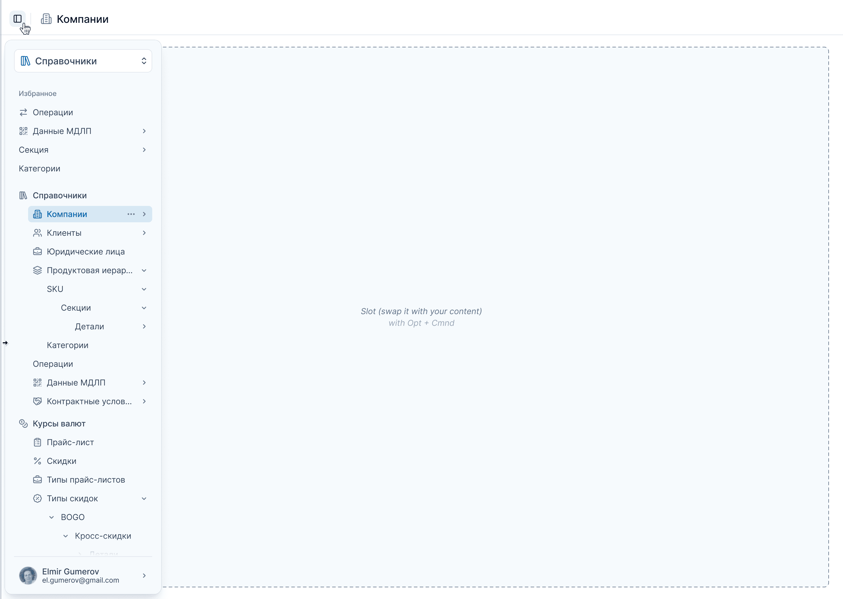
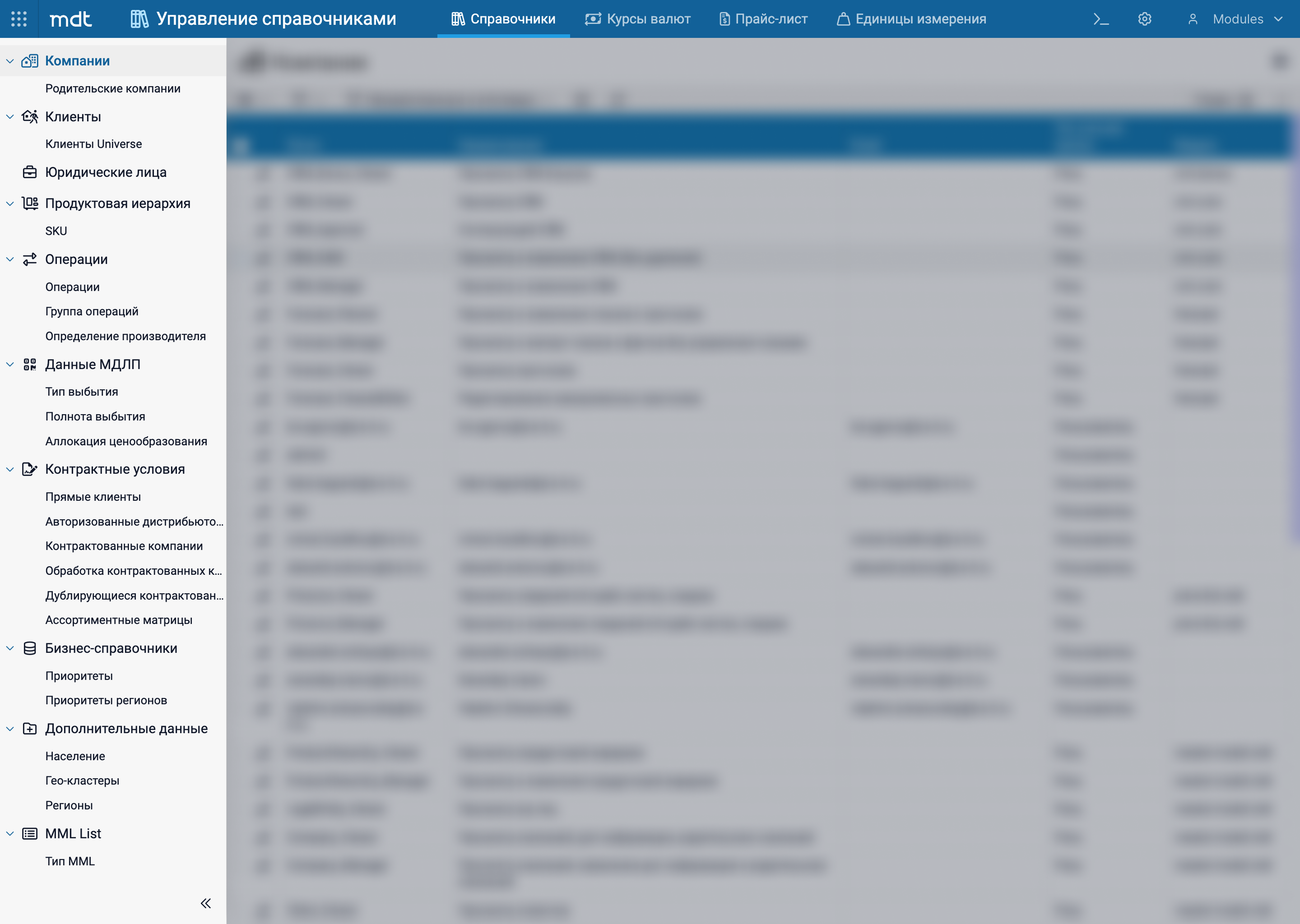
MDT is an enterprise B2B platform that unifies business processes, data, and roles into a single ecosystem. Multiple applications — each with its own logic and user scenarios.
This is not just a consumer product measured in delightful moments. It is a system measured in clarity, predictability, and the cognitive cost of everyday work.
The navigation grew gradually, shaped by immediate needs. The top-level structure was implemented as a tab bar — visually felt like a secondary element, not the primary orientation layer. Different modules behaved differently: some tabs duplicated the sidebar, others contained their own content.
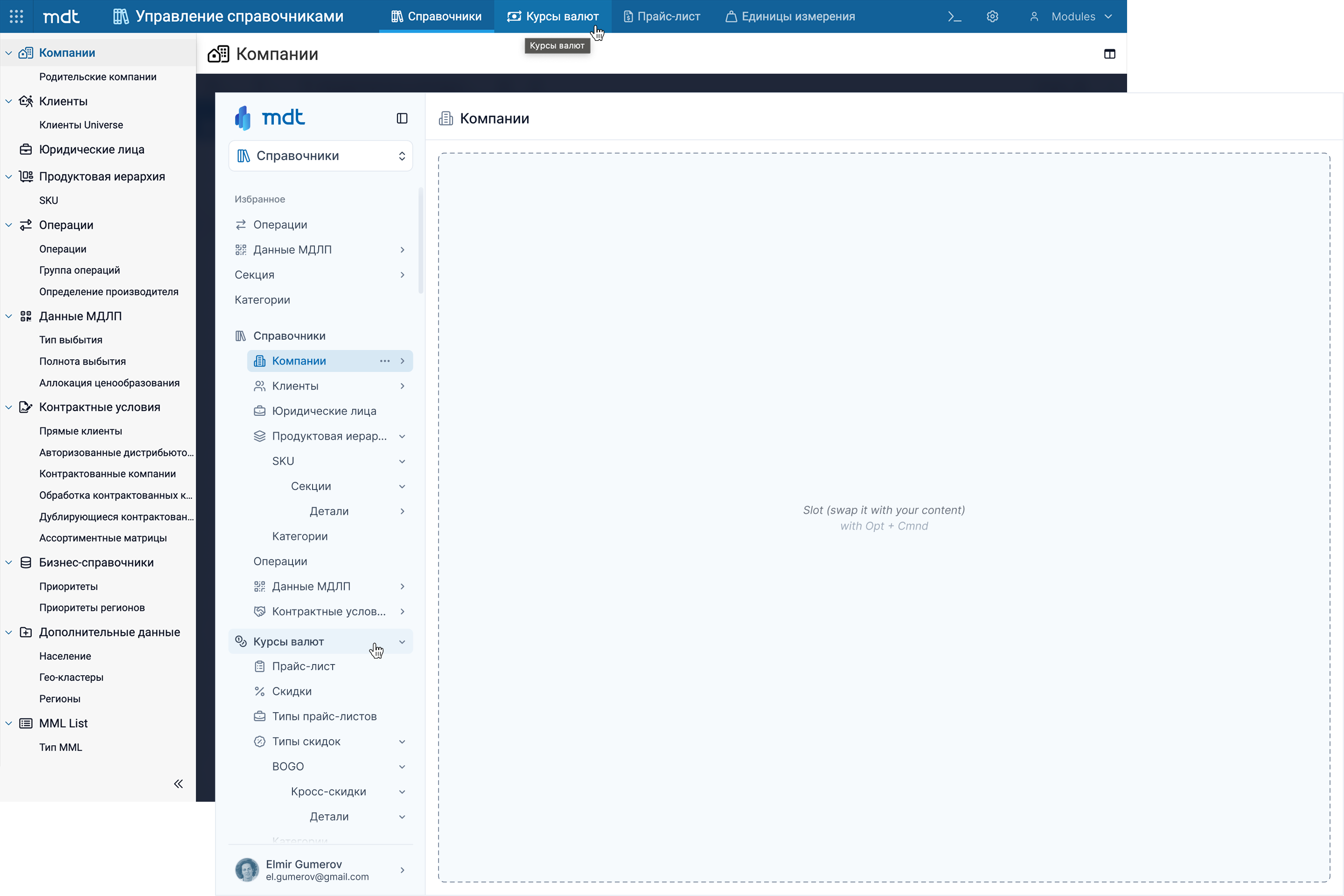
Top-level nodes couldn't simply become section headers — some contain their own content, others are pure grouping nodes. A naive restructure would have broken existing workflows.
If a node contains no content, clicking it selects the first child with content. No broken states, no dead ends — no disruption to users who had learned the old paths.
Top-level navigation looked like module tabs — users couldn’t tell it was the main entry point to the system.
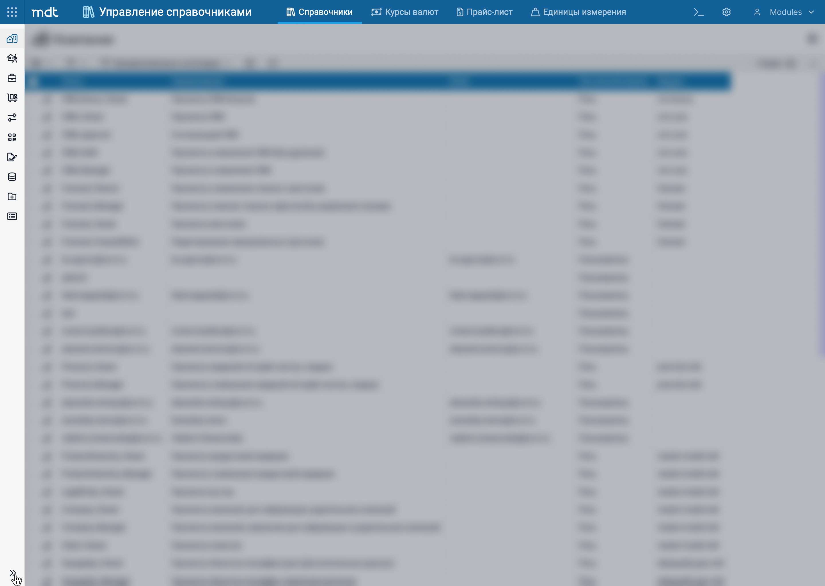
Collapsed Sidebar — icon strip. To understand any icon, you had to hover and wait for a tooltip.
Some navigation nodes had no icons — in collapsed view, they simply disappeared.
App switcher — 9-dot grid. Gave no indication of which application you were currently in.
Profile buried in top bar — no visible account context.
Sidebar as the only navigation source.
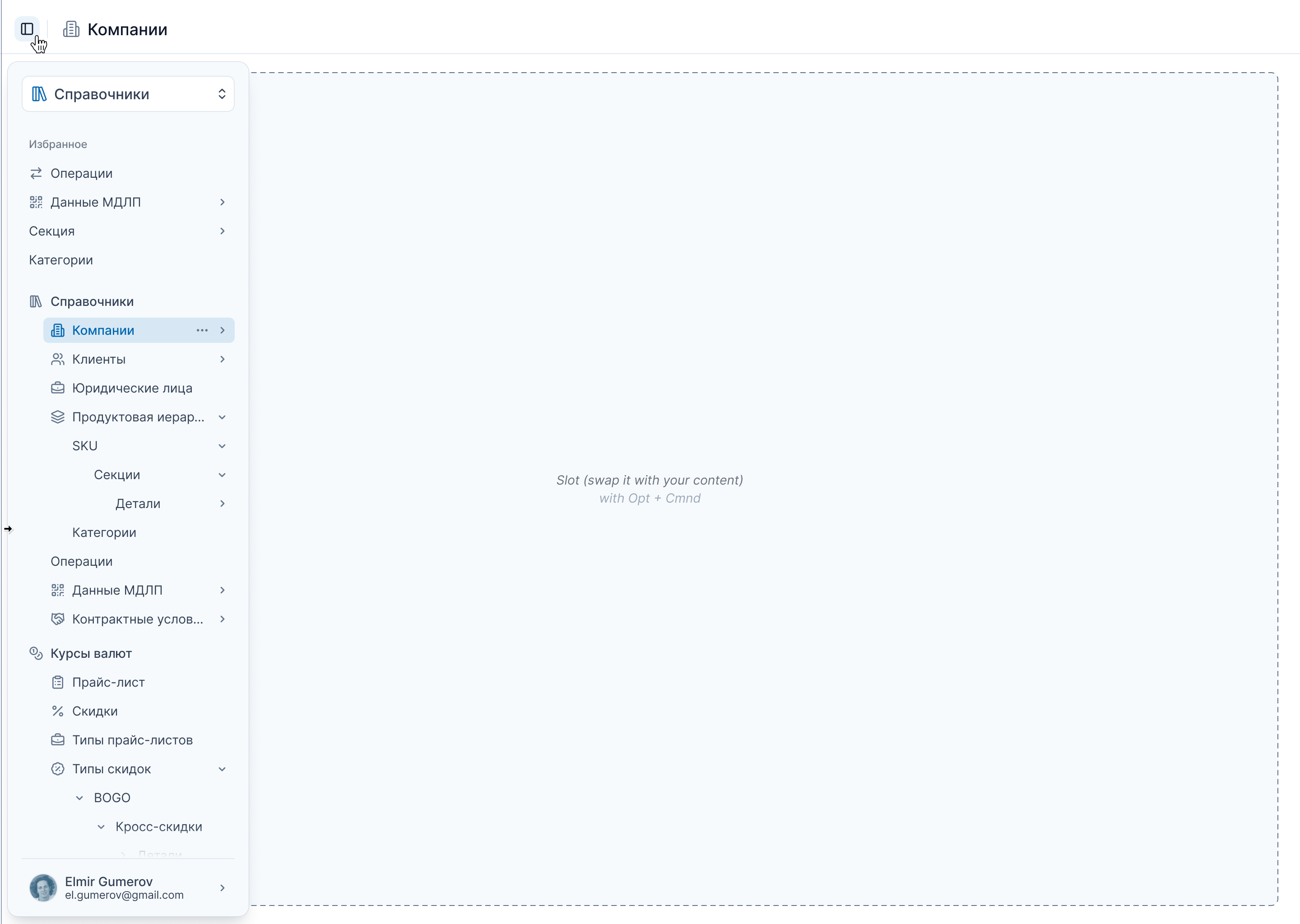
Collapsed Sidebar — floating panel, opens on button click or cursor approaching left edge.
Hierarchy visible on hover, communicated dynamically.
Current app name as switcher trigger. Always clear where you are.
Profile at sidebar bottom — name and email always visible.
Top-level navigation looked like module tabs — users couldn’t tell it was the main entry point to the system.
Sidebar as the only navigation source.
Collapsed Sidebar — icon strip. To understand any icon, you had to hover and wait for a tooltip.
Collapsed Sidebar — floating panel, opens on button click or cursor approaching left edge.
Some navigation nodes had no icons — in collapsed view, they simply disappeared.
Hierarchy visible on hover, communicated dynamically.
App switcher — 9-dot grid. Gave no indication of which application you were currently in.
Current app name as switcher trigger. Always clear where you are.
Profile buried in top bar — no visible account context.
Profile at sidebar bottom — name and email always visible.
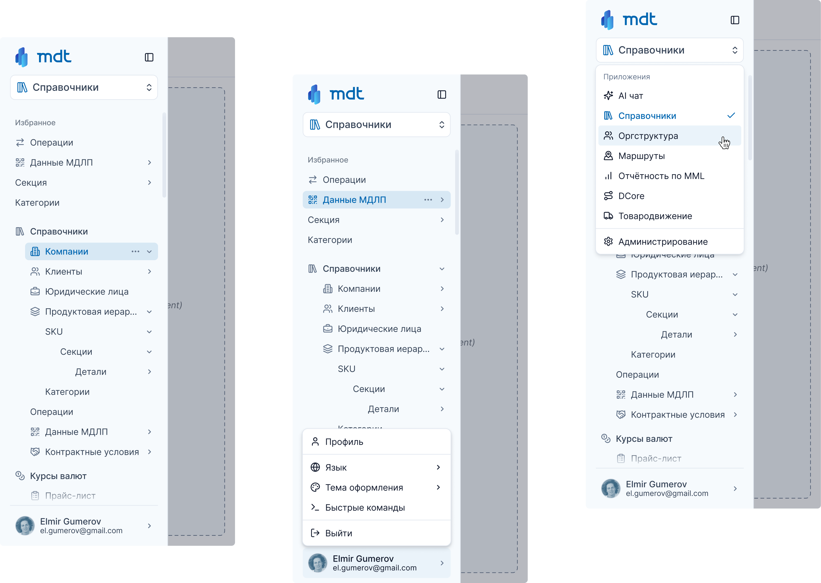
Mobile follows the same logic — not a scaled-down version, but the same system.
Same hierarchy, same structure, same navigation depth. Nothing was simplified for the smaller screen — only adapted.
Navigation became a predictable system.
New modules without new patterns.
Manageable dependencies instead of fragile chains.
Cognitive load reduced in daily work.
Accumulated UX issues resolved systemically.
All apps under single navigation logic.